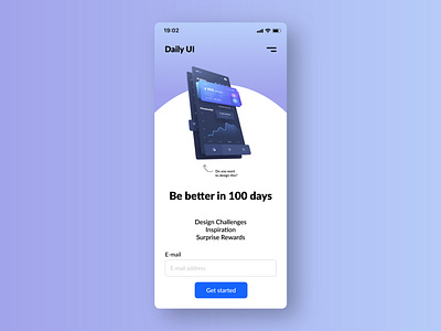
DailyUI #100 - DailyUI landing pag redesign - Mobile
Since it is a challange for UI, I think it shoul change its appearance, I mean the website, according to the trends but taking into consideration accesibility as well. For me was really bothering the lack of the navigation bar. In this way I didn’t know what’s on the site unless I scrolled. Also should include some examples of catchy and great UI designs to trigger the challange takers emotions.
🙏 Thank you for the opportunity dailyui challange. It was a great experience, it boosted my visual, UI and UX skills, critical thinking and I have developed knowledge in Figma. I recommend it for everyone who wants the same!
More by Nimrod Szigeti View profile
Like
