ID Card Redesign
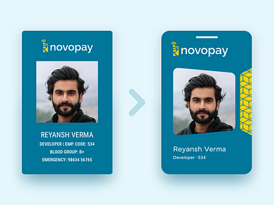
I did this ID card redesign exercise for Novopay, a while ago. The old design was drab and lazy. So we decided to do a redesign.
I wanted to make the design minimal and connect every element logically. The container shapes imitates the logo, tilted in perspective. And I adjusted the rounded corners for optical correction.
To make things interesting, I included an accent in the brand's secondary color. And I created a system of patterns for the departments, that weaves within the accent. Each reflecting elements that symbolizes that particular department. This will make each card unique to its holder. I made the patterns seamless. So they can be extended for other purposes. Like stationery, merchandise etc.
---
Hit "L" if you like ❤️ this shot and comment your feedback. Much appreciated 🙏🏾
---
Photo Credits: https://unsplash.com/photos/8BcVHmAHtlw


