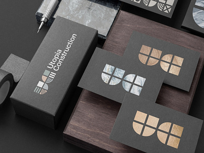
Constructing Utopia
From the simple to the complex, the basic to the luxurious, Construction is not a descriptive enough word for such a multi-faceted industry. Utopia Construction's team of highly skilled craftsmen offer attention to detail and outstanding value for money and came to us looking for a visual language to help explain and promote their services.
The brand needed flexibility. To express a sense of solidity and structure but it also needed to convey a sense of craft and creativity. Utopia Construction is a company that focuses on the tiniest details in projects so it also had to have scalability and be able to keep a freshness and vitality over time. The solution is a modular brand of quarter circles and squares, the most basic of building blocks that are put together to form the UC of the brand icon. We then generated multiple versions of squares and quarter circles to create a brand vocabulary to draw from to keep the identity fresh and contextual. Bold, legible, strong yet engaging, and contemporary.
The website solution is clean and clear, faithful to the brand at every step. Attention to detail was paramount in communicating Utopia Construction's eye for flawless execution. This user-first, device-agnostic digital platform provides a foolproof online experience that mirrors the ease of working with the team in person and shows off the brand's portfolio at the highest level.


