How awesome is this?
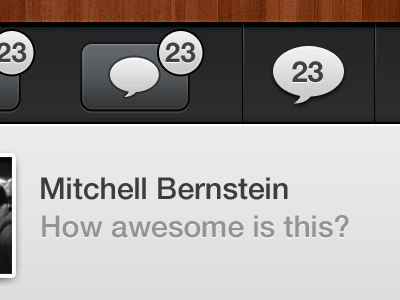
Which seems better for the interface? This iOS application shows an image on this page. Under, there is a set of buttons that allow the user to reply, like, etc. What would be the better way to go? The right one or left?
P.s- This is my first shot! And I really would like to thank Robbie Pearce for inviting me! Check him out, he rocks!
More by Mitchell Bernstein View profile
Like
