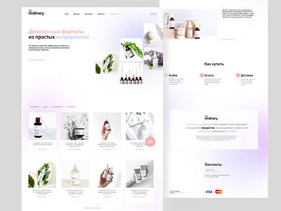
Online store of natural cosmetics The Ordinary (concept)
Hello Dribbblers,
Presenting a Modern and Trending Landing Page UI for online cosmetics store . I tried to make it look clean with more white space and tried to use some bright colors for the design to make it look interesting.
Please share your feedback about the color choice and placement of the elements.
If you like what you see, don't forget the press the ❤️
More by Lotta Sheinman View profile
Like
