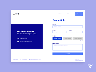
ADROIT Contact Website Design
This was a quick web design I did for a client. The proposed website was supposed to be made fast and accessible to potential work/clients. It just needed three pages and mainly using images or pure text.
I ran through a few sketches for this website until I found a cohesive design that was simple and straight to the point. This was just a mock-up of the websites layout.
Enjoyed this little website, due to how fast the process was and just thinking about this on the fly. I liked the colors, I would play the colors a little more, but fun overall. It did fall through, but I enjoyed the process.
- Designer / Buddy
More by Erick Vidal View profile
Like
