Relationframes
A little while ago, I was part of project called Baseline; a refresh and refinement of the Zendesk brand guidelines aimed at bringing more consistency to our brand language. The project was focused on typography, colour – and layout, which was my focus on the team.
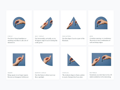
Shapes are at the heart of the Zendesk brand. We wanted to translate those shapes to the wider brand language – as a framing device for photography. Dubbed the Relationframes, we also added a new shape to our shape palette, alongside refreshed usage guidelines.
Here you'll see some of the early mocks to stress test the system, but check out the full guidelines on Brandland.
Team Credits: Claire Moore, Nick Levesque, and Emily Mueller.
Hat tip to our amazing copy team for the inspired shape descriptions.

