Landing Page Design
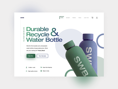
🧾 SWB (Strong Water Bottle) brand landing page design concept. The brand provides high-quality material water bottles that can be recycled and responsible for saving the environment.
📚 Typography - Neue Helvetica and Inter(Heading, subheading, paragraph, and subtitle) typefaces are popular and easy to read. Helvetica is among the most widely used sans serif typefaces and has been a popular choice for corporate logos, including those for 3M, American Airlines, American Apparel, BMW, Jeep, JCPenney, Lufthansa, and more.
🌈 Colors - Blue(symbolizes trust, loyalty, and confidence) and green(symbolizes balance, progress, and environment).
👉You need a second to show some love by tapping the ❤ button and give valuable feedback.
Peace 😉!
🎉 Portfolio:
Behance: https://www.behance.net/suvamp
Dribbble: https://dribbble.com/suvamprasad
📞 Work-related queries contact me through:
Email: suvamprasad5@gmail.com
Instagram: https://www.instagram.com/suvamuxui
Twitter: https://twitter.com/suvamprasad2
LinkedIn: https://www.linkedin.com/in/suvamprasad
