Mittal Group of Companies - Brand Guide


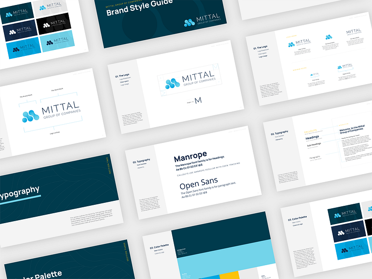
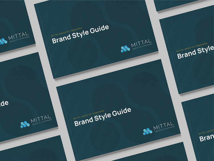
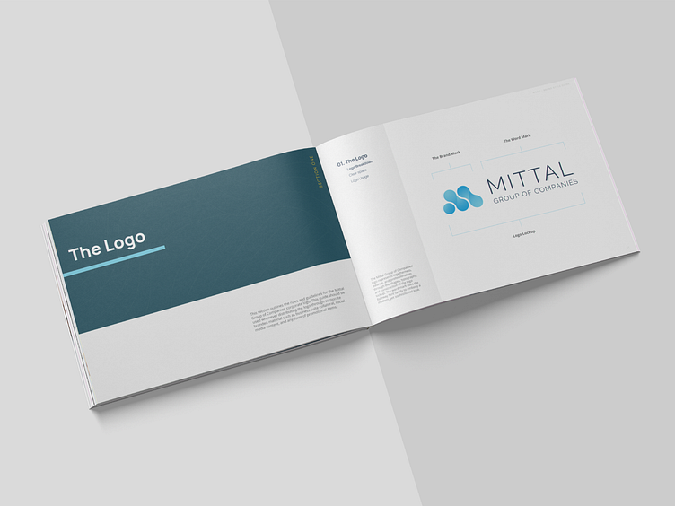


Today we're also sharing the Mittal Group of Companies' branding style guide! We worked with our clients at MGOC for months before finalizing the brand image and identity. It was important for this brand to come across as sophisticated, intelligent, professional and modern, which our team kept in mind throughout all steps of this creative journey. We used modern shapes to create the monogram for the M, and paired that with a stacked sans serif word mark to add structure to the logo. The branding also explores simple and structured layouts to give the identity a corporate look and feel. The cool blue and teal color palette is paired with a bright accented yellow to add a punch to the overall image.
Stay tuned for more fun pieces of this project that will be released later this week! ✨

