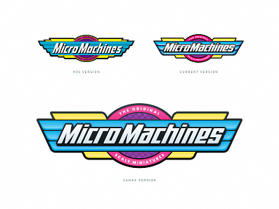
Micro Machines logo
I really like the new logo of Micro Machines, because it has the same vibe of the 90s logo. But there are two things that I think can be better. First, the new logo have too much shine compared with the original one totally flat. Second, that all the lines don't use the same inclination drives me crazy 😅
More by Gustavo Zambelli View profile
Like


