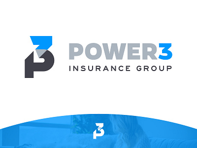
Power 3 :: Logo
Exploring sturdy, robust logo variations was a must for this client in the insurance industry, due to the company being built on the strong relationship and combined insight of three brothers.
We applied color to the mark in such a way as to maintain the legibility of the “P” and “3,” with the “overlapping” section in a contrasting gray that makes the shape feel translucent.
—
Looking to take your brand to the next level? We would love to hear from you. Email us at hello@llt-group.com
More by LLT Group View profile
Like
