Bank Saint Petersburg
The Private Banking logo is based on the Bank Saint Petersburg logo, but coloured gold and with an additional descriptor in the Cera Bold typeface.
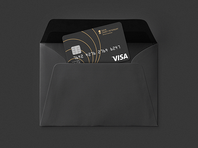
The digits in the typeface were born of the rings’ linear alignment, a key characteristic being that their thickness doesn’t change even when the digit is enlarged.