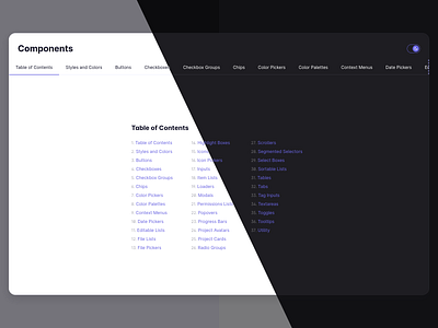
Component Library Overview
One of the first things I tend to do when working on a large project is create a set of base components that can then be used to build more complex parts of the application.
It might seem wasteful to re-create such components from scratch every time and not use a library, but in my experience it’s the only way to ensure full control over how the components look, work, and feel. Using a library for a small side project is fine, but as soon as it’s something bigger, I often find myself fighting against the library, not to mention that it means adding and maintaining yet another dependency.
For this project I additionally created a modal that could be opened at any time via a keyboard shortcut. It contains documentation about every base component as well as different permutations of each component with different props. This way it doubles as a visual testing ground and a documentation that’s easy to open right where it’s needed.
