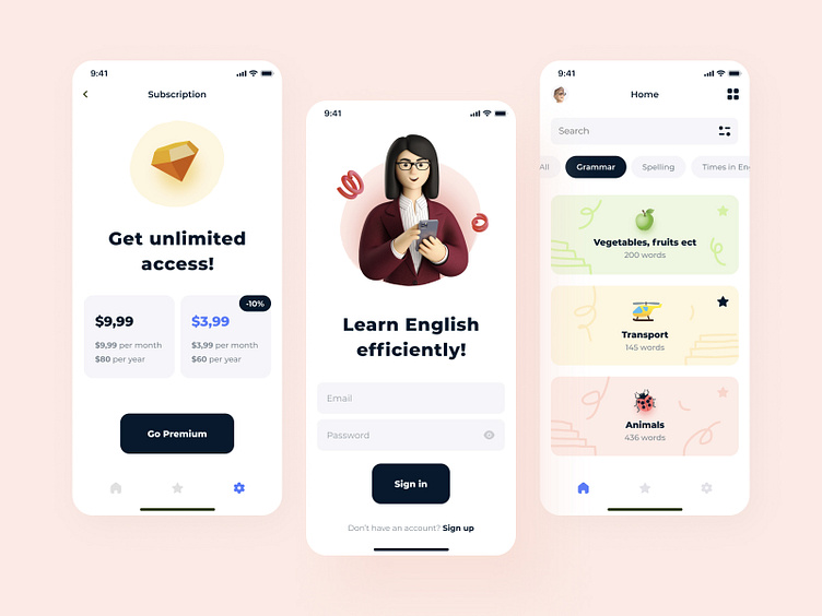
Education mobile platform
Hey all! How easy and fun is it to learn English? Off - with this application, it’s as easy as shelling pears as it gets, yet effective. In this application, I used the most cracking emoji and 3D illustrations to attract the primary target audience of the client - teenagers and 20+. Look for a clean and neat design. And UX is even more intuitive than it was before. The redesign worked very well. I’m still working on the design, but I couldn’t help showing you the three main screens. What do you think?
Design — Figma
************ 💌 I am open to new projects! hey@migulko.cz ************
More by Taras Migulko View profile
Like
