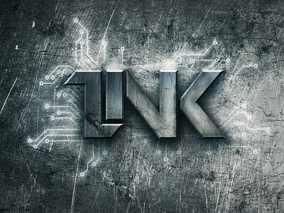
Link Games Logo Design
This is the LinkGames logotype. The Idea was to represent the word 'link' in lettering and therefore I linked up all of the letters in sort of a seamless flow. It might look a little confusing when you first see this logo but once you get it, you'll probably think it's quite smart (at least I hope you will). :)
I was trying to achieve a grungy look and added conductor lines to make this logo feel a bit more techy.
You can see a sketch of this logo here.
Check out LinkGames on YouTube.
More by Roberts Ozolins View profile
Like
