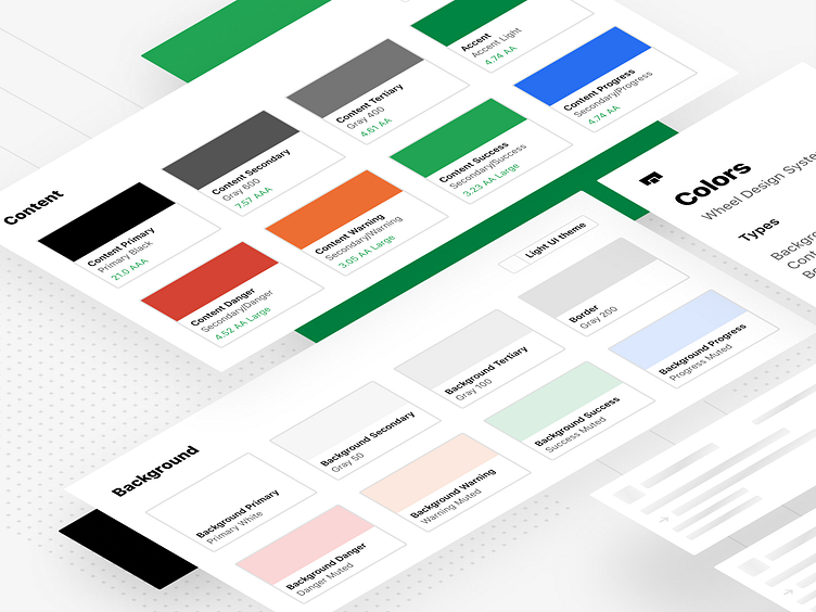
Wheel Design System - Colors
A peek at our finalized and standardized color palette across all our product platforms. Accessibility and scalability were top of mind when we were developing our color system, creating a very intentional color system around our products. We even put a lot of thought and used the same base color system to develop loading and skeleton states as well.
Our palette has absolute values that translate between light and dark modes, creating a familiar yet usable platform for our design team to build on. Our colors are named around their purpose vs named around their value in order to remove any subjectivity around nomenclatures.
These values were implemented across our web and mobile applications, and we worked closely with our development team to reflect the same thought that went into our design naming paradigms in code as well.
