Design mobile layouts faster
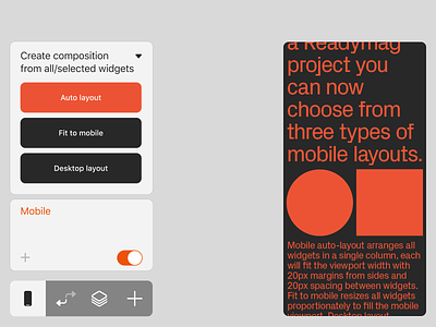


For the Mobile version of your projects you can now choose from three types of mobile layout: Auto layout (arranges all widgets in a single column, each will fit the viewport width), Fit to mobile (resizes all widgets proportionately to fill the mobile viewport), and Desktop layout (everything looks as it would on a desktop display).
These options can also be set for any selected widgets or widget groups, allowing you to lay out mobile variations with only a few clicks.
