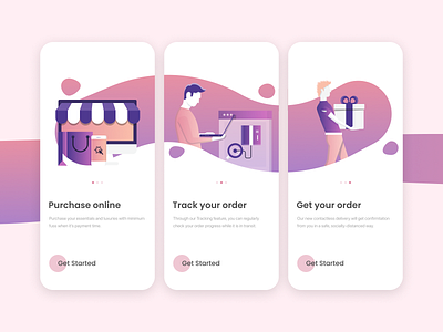
Onboarding for E-Commerce Applications
Hi, Dribbblers!
We’re happy to share some of the visuals done for an e-commerce onboarding application. The aim was to reduce the clutter that regular onboarding and walkthrough screens pose and improve the process efficiency.
We try to design better screens, better user experience and a better way of using technology in the process. Our best shots are coming up, so stay on top of things!
How did you like the onboarding screens we posted? Let us know in the comments!
More by UXHunt View profile
Like
