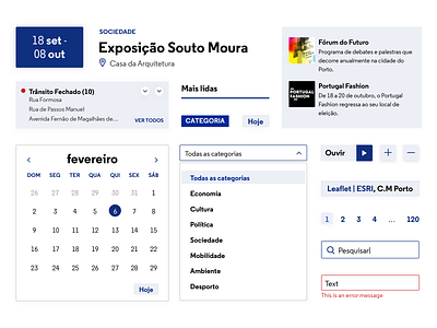
Porto. Website • Components
Hi, Dribbblers! 🏀 Another day, another shot.
Creating a design system from the very beginning ensured a consistent and scalable news portal. Once the Homepage and Look&Feel got approved, Pixelmatters established rules to ensure that other pages could easily replicate layouts and components.
Above all, having a design system guaranteed a uniform visual language but flexible enough to be applied across different touchpoints.
Read the full story → Case Study
—
If you like our work follow us on Twitter, Facebook, Instagram and/or Behance.
More by Pixelmatters View profile
Like
