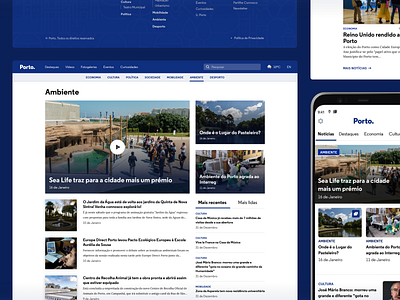
Porto. Website • Process
Hi, Dribbblers! 🏀
We had to create a news portal with a distinctive Look&Feel, capable of reflecting Porto as a city, but that wouldn't be a reminiscence of the brand. So, it became an iterative process without ever forgetting the key purpose — to amaze the user with a delightful reading experience.
After understanding the do's and don'ts, Pixelmatters also defined the guidelines to adapt the brand identity reflected all over the city to the digital space. The brand had to be consistent and stand out in every existing touchpoint.
Read the full story → Case Study
—
If you like our work follow us on Twitter, Facebook, Instagram and/or Behance.
More by Pixelmatters View profile
Like
