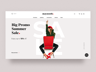
Landing page
Hello everyone,
I would like to presenting my new case study, a Modern and Trending Concept of eCommerce website for Furniture Company. I tried to make it look clean with more white space and tried to use some bright colors for the design to make it look interesting.
You can check the full case on my Behance
More by Liliia View profile
Like
