FootJoy - Rebranding Concept
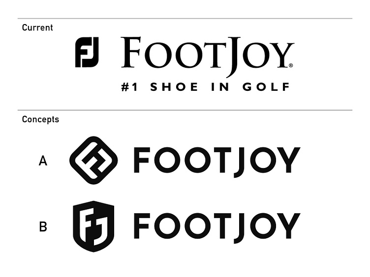
...well - I recently did some custom shoe painting on a pair of golf shoes for a friend of my father. It happened to be a pair of FootJoy's. I did not know the company and was shocked when I read "#1 shoe in golf" on the side of the shoe box in combination with the logo I was looking at. I felt pain when I looked at the FJ and to me the logo looked like it was from an upcoming brand which intentionally goes with a poor logo to suggest low price products but nothing like the market leader.
I did some research and was surprised when I found out that - according to a marketing video - sales had increased after the new 'modern' logo was introduced. I also noticed that the FJ carries over the letters from an earlier logo to probably give a nod to the past and keep up some tradition. I guess that more often than not that this is a good idea. But I'm sorry - it doesn't work for me here because that type and the way it is put together just looks sub-par.
I felt that - to stay in the pole position - and when trying to be modern - you actually should be. And while some shoe models of the product spectrum still look very traditional there should be a symbol that is suitable for being a small silver embossed emblem - and at the same time have some style.
So I came up with these two ideas and would like to hear your thoughts if one of those would have the chance to help FootJoy stay in their position. Plus I also would like to know how you feel about the current logo.