Organic food complexes logo
From the brief: "Production and sale of health food complexes. Market - nutrients. Segment - 100% organic food complexes. Target audience - upper and middle class, adherents of a wellness lifestyle. Product positioning:
- quality - the highest
- the price is high
- design - premium
- uniqueness - 100% (innovative developments of Russian scientists - there are patents, certificates, clinical trials)
Subtanica \ Sabtanica \ - the name of two English words - substance and organic. Sounds like classic science (botany, organic). useful organic products. The style is discreet luxury. Luxury in our understanding does not allow the presence of gold monograms, lions, crowns and other attributes. And also - such an associative series of concepts: the power of nature - the power of science - the power of man. The symbol should correspond to eternity.
This "pearl" of Russian scientific thought must be appropriately "dressed" ... but not clumsy, but aristocratic and with dignity. "
Color wishes: platinum on black, possibly glowing and malachite green.
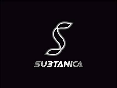
Proposed and approved option:
The sign has several meanings 1. The first letter of the name; 2. Association with science and human biology - DNA; 3. Association with organics or plants (eg algae); 2. Subconscious association with the bends of the sign of eternity - an eight or a vector.
The name font is unique, designed specifically for the Subtanica company.