Carehood - Home Page
Hey folks,
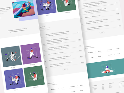
Continuing with the Landing Page of our Carehood website. The flow of the entire page goes like - Greetings -> Quick description -> Top pages for support -> News from the Health Department -> Open Positions in Careers -> Lovely illustration to break the tension created by the page -> and Footer.
I had the complete responsibility for each an every atom in this design. I had a little issue in the beginning with typography, I chose a very creative serif font for the headings and that killed the readability, so I came up with a much accessible font and the problem was solved.
With the News component, I could have gone the default card-component style but there's a card component right above it pointing top useful pages in the website. So, that approach was a no-go as it might create confusion in the users. I had to come up with something creative and aesthetical one but on top of all that it must match with the current design. Boom! Did the magic again. A totally new style to showcase news. You can look that up in the design.
These were the major issues and challenges that I faced will designing the home page. The small ones aren't worth mentioning it will be really boring if I did.
Hope you guys like it 👍
If you want to work with me then click that "Hire Me" button duh! 🥳 or if you're looking to connect with me I'm on Twitter 🍕