proton branding / redesign / logo
Redesign and branding proposal for proton (Proton Technologies AG). A leading swiss technology company.
After my survey for visualizing a proton, it was clear that 100% of the participants would see a dot/ball. Based on that survey I've created a simple and versatile branding solution which can be easily extended and compete with other major brands.
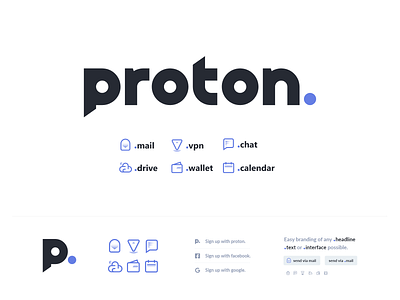
The main brand logo which represent the whole suite of products is a simple custom font which conveys a modern & professional feeling to gain trust, followed by a simple blue dot, which underlines the name and represent a proton to make a bold statement of convidence.
The product logos (WIP) continue on that idea and are a combination of a word and figurative (icon) mark which can be also used as a standalone icon or single wordmark. While the branding character of the product logos is coming from the wordmark, the simple icon surve as a supporting visualization of the product. This makes it very versatile and usable in any format, scale and color for interfaces, textblocks, iconfonts and ads etc.
You can simply put the brand logo with the product logo together to create a combined logo like: proton.mail or proton.vpn or proton.drive
I hope you like my concept :)
cheers
kev
