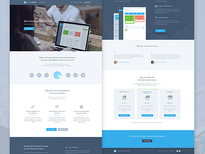
Invoice Sherpa Homepage Redesign
Evoking a more professional look & feel with a better understanding what invoice sherpa really is.
The current website doesn't really showcase the functions that sherpa offers, so our job was to make it more professional & visible.
Anyhow check the 3 versions that are somewhat different in some areas but all in all manage to present the same content.
More by Balkan Brothers View profile
Services by Balkan Brothers
Like
