Luke Cookz

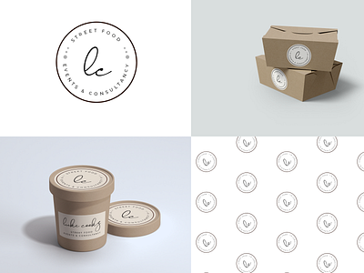
I was hired to design the logo and create branding materials. As part of the work, I created the van signage, business cards and environmentally friendly packaging for the food boxes.
The logo needs to inspire sophistication, given the chef’s credentials, and modernity, given its concern for the environment. As such I recursed to using calligraphy with a San Serif type font.
The symbol hints at a plate with the letters LC, initials for Luke Cookz. The letters, as well as the dots on the side, resemble food (sauce) decorations that you find in many well presented dishes.
Find more on
https://www.behance.net/katarinatrinh
Thanks for watching!