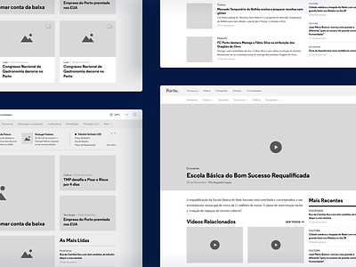
Porto. Website • Wireframes
Hey, everyone! 💫 Let's take a closer look at another shot of the Porto. Website.
After defining the homepage's wireframe, while reusing some of its components on the news portal, we set the tone and interaction of the other pages.
In addition, we used high-fidelity wireframes to present new pages and UX improvements easily, which allowed both teams to quickly analyze and validate them, focusing on how the future news portal would become.
Read the full story → Case Study
—
If you like our work follow us on Twitter, Facebook, Instagram and/or Behance.
More by Pixelmatters View profile
Like
