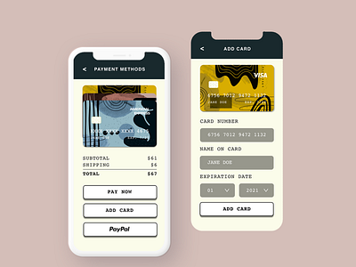
Daily UI 001 Credit Card Checkout
Challenge for Daily UI Day 2. The challenge was to create a credit card checkout screen. I started with a pink background but realized that wasn't the best choice in terms of usability and readability. The cream colored background makes the whole experience feel less sterile and more personal. I chose Courier as the font to give it a more fun, retro vibe. I think this branding would work well for a clothing or lifestyle brand.
More by Jessica Wood View profile
Like
