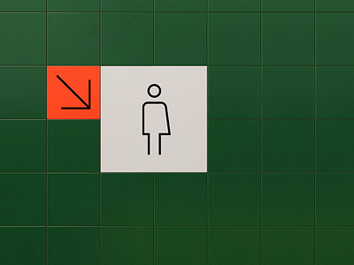
Genderless Restroom Icons
Hey!
There are many aspects of design that lead to a stereotyped result. An icon can contribute to that. Straight, sharp edges are often masculine whereas smooth, curved lines are more feminine. So, what’s the middle point for a genderless icon design?
I’ve been working on finding the answer to this question by rethinking the classic public bathroom icons. The solution goes from representing a genderless person, to redefining what should the sign show. What about dividing by time spent inside the restroom?
Hope you like it! 🏳️🌈
Check out the whole article Nacar Team has developed in occasion of Pride Day: Re-defining Gender Roles in Design
More by Nacar Design View profile
Like


