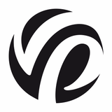
Quality dry mixes logo
The client asked for a modern logo and no more.
The accepted version carries a European style and at the same time an association with Soviet quality. The first letter of the name, Q, is shaped like a Soviet quality mark and a construction trowel at the same time.
Good association, memorability and idea.
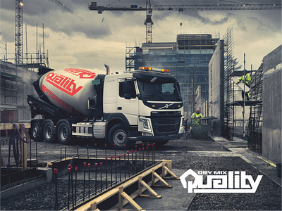
Look how interesting, in this work, for example, the letters are lined up - there is clearly an association with the laying of something (bricks, tiles, etc.) Write in the comments your opinion, do the clearly laid lines give a feeling of strength, reliability, quality?