KoreLock - Logo Design
KoreLock - Logo Design
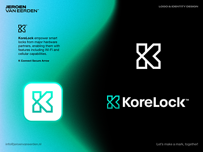
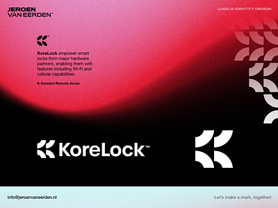
KoreLock empowers smart locks from major hardware partners, enabling them with features including Wi-Fi and cellular capabilities.
By applying this subtle and minimal visual form, some of the main elements come forwards very well. Somehow this symbol looks very bold and timeless to me.
Concept ingredients:
- Letter K
- Connect
- Secure
- Arrow (aiming towards junction inside)
Would love to hear about your thoughts on this concept.
Happy new week everyone! ✌🏻❤️
Interested in working with me?
Let's make a mark, together!
More by Jeroen van Eerden View profile
Services by Jeroen van Eerden
Like

