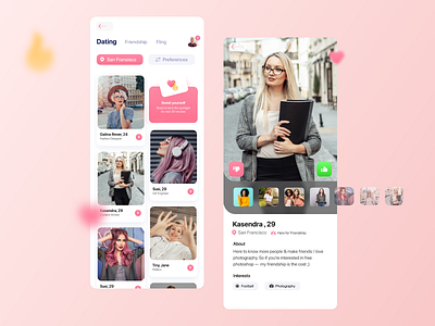
Dating App UI | Listing & Detail Screen
The brief was to come up with something intuitive and original.
Client wanted a very simple and easy to navigate screen for preferred listing. Where user can input the location and preferences. Client wanted to have a 'boast yourself' call to action right on this screen to encourage the users.
The challenge was to somehow include three major types of connections (Dating, Friendship and fling) in the screen without creating visual clutter.
Open to freelance jobs: kasim@compassdesign.co
More by uxkasim View profile
Like
