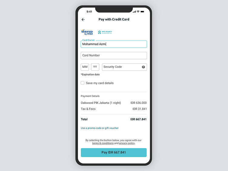
Credit Card Checkout
I improved a little bit on one of my very first designs. The idea was to give it more whitespace, so it doesn't look cluttered. And I also didn't want to make it so beautiful, so it looks kind of formal or serious.
More by Mohammad Azmi View profile
Like
