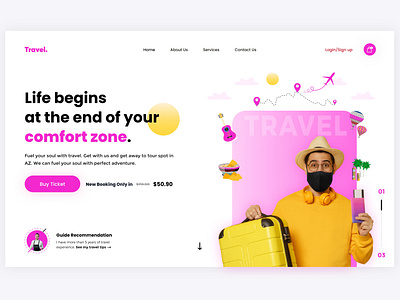
Traveler Landing Page ui
Hello friends,
I have designed a traveler landing page banner UI to give a boost in sales for travel/tour companies.
By now flat design has become a ‘classic’ look around the web. And for good reason, I have used this approach up to some extent.
The main principles of flat design prompt:
1. Clear hierarchy to speed up information processing.
2. Action-emphasizing iconography and adaptive design.
3. Usage of familiar patterns that helps us quickly understand affordance.
All of these elements add up to a great web/app design experience.
But if you aren’t a designer by trade, how can you make a website that looks great and brings in sales?
Luckily, I'm a designer by profession and I can help you enhance your website/app visual appeal for better customer retention and boost sales.
Let's strategize and discuss for free.
WhatsApp: +923067734944
Skype: umairrazasyed_1
Instagram: https://www.instagram.com/umair_uiux/
Twitter: https://twitter.com/umairrazasyed
LinkedIn: https://www.linkedin.com/in/umair-raza-syed/
Behance: https://www.behance.net/umairrazasyed
Thank You!
