Mirve Resort | Branding, Corporate Identity & UI/UX
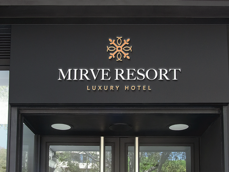
The choice of the name is the union of two italian words "mirto" and "venere". The pictogram represents the flower in question in a very stylized and refined way. The payoff indicates the category of the hotel. The pictogram minimally represents the myrtle flowers. The stylized shapes want to give elegance and uniqueness to the brand. See the full project on Behance: https://www.behance.net/gallery/119835693/Mirve-Resort-Branding-Corporate-Identity-UIUX
