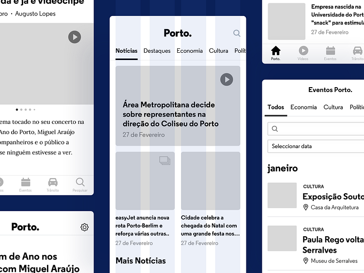
Porto. Mobile App • Wireframes
Hey, Dribbblers! 👋 There is no good design without a user experience that flows. So, we started by identifying the critical scenarios, the user flows that were not flowing, and what improvements could be made to get to a newsworthy experience.
The goal was to improve the Porto. Mobile App's usability by transforming friction points into attractive features. Like category-oriented navigation or the search bar, both missing on the current mobile application, a must-have in a news portal. There was also a "house cleaning". Categories were eliminated, merged, or new ones were added, all aligned with the city's main pillars.
Read the full story → Case Study
— If you like our work follow us on Twitter, Facebook, Instagram and/or Behance.
More by Pixelmatters View profile
Like
