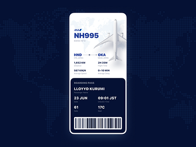
Boarding Pass for Booking APP
Day 24 Challenge: Design a boarding pass.
It took me quite long time to finish this challenge.
First I found a plane 3D model and re-rendered it. Adjusting the lights was really hard but also I learnt a lot. And thanks for this guy who shared me the model by free https://sketchfab.com/mudkipz321
Then I spent some time for collecting the information using in the boarding pass and grouped them. To avoid misunderstanding when user catching the flight, I deleted all other time such as take off / landing time in this UI with just checkin time left.
Finally was the UI adjustment. Those changes were all subtle things like the alignment and the plane model position but finally made the UI more designed-feeling than before.
There are still many interaction and information that I want to add to this APP such as seat booking or full flight information. I will do a redesign after the challenge to achieve this. Good night.
