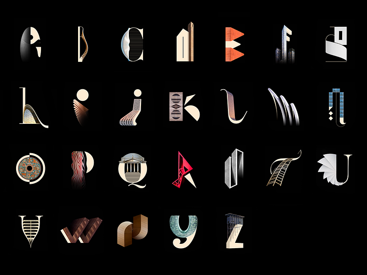
Architype Alphabet Typography
Here is the overview of the whole Architype Alphabet Poster created for 36 Days of Type 2019.
My concept for the 36 Days of Type 2019 was simple, combine typography and architecture to create a custom typeface. For each letter of the alphabet, I was inspired by a famous architect and one of its buildings.
The link between the construction of an architectural structure and a typeface has always amused and fascinated me. Mixing curves, angles and lines to find the perfect balance and the right degree of abstraction.
It was a great deal of fun participating. I was happy that my entries got featured by the great Stefan Sagmeister.
So, what's your favorite letter?
More by Lucchini Johann View profile
Like
