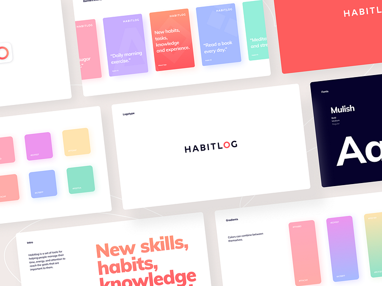
Habitlog - Visual Guidelines
Hi guys! 👋
This is part of the Visual Guideline we made for the HABITLOG. ⭕️
The main direction of the brand is a light, minimalistic and friendly space. The white light background gives the impression of a journal page vibe. Complementary pastel colors serve a friendly function, focusing only on the important. All colors interact well with each other and combinated in a gradient.
The visual identity perfectly complements the minimalistic interface shown earlier.
Share your thoughts about the project in the comments! 🔮
📩 Interested in Brand Identity? Check out more on arounda.agency and contact us info@arounda.agency
More by Arounda View profile
Like

