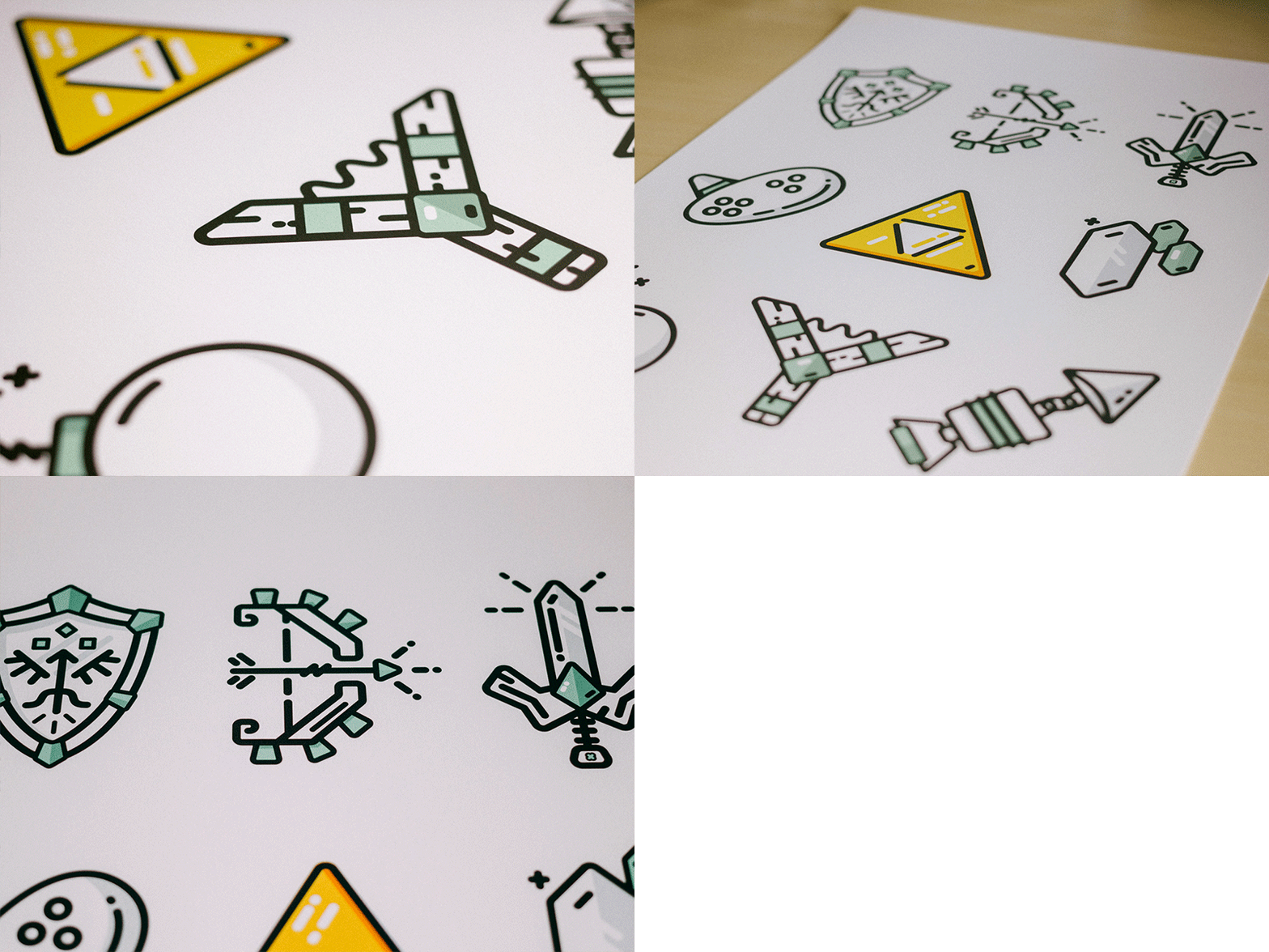
Zelda Minimal Essentials
It's in the shop if you want one for yourself.
The simple icon style I had experimented with for Wagepoint's new site turned out to be really fun, effective, and seemingly well received.
That being said I explored a bit further with some more fun stuff, essentials of zelda. Not _the_ essentials, but some.
My goal was to continue with what my focus has been lately of taking (sometimes) complex items and breaking them down as simply as possible. Usually I do it in a much more 'free form' way, but tying myself to the basic shapes and geometries was a new restriction that led to be really helpful creatively.
I really wanted to see how this stuff would look on a big 13x19 320gsm super white paper and it is very crisp and tasty. Attached full view.
Photos by Monica Justesen


