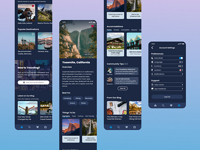
Tripfarer - Travel App UI Design
Traveling to faraway lands and beautiful views has always been so inspiring to me. I wanted to catch the same feeling with this concept design for a trip discovery app and website (see separate project for the website version). Definitely made this feeling COVID-19 wanderlust!
I used Google's Material Design principles for designing in dark mode. Many social media and related apps now all have the option to switch between light and dark mode, and dark mode is sometimes preferred to conserve battery and less straining on the eyes if the application is used for long periods of time. Users also have the option to switch to light mode if preferred.
More by Lucille Tang View profile
Like
