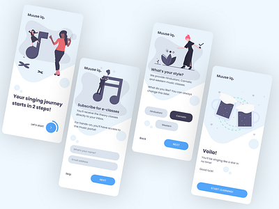
DailyUI 023 Onboarding screens
Just finished my design for #dailyui #023
#DailyUI
Today's goal was to concentrate on extended use of blue hue for colors.
On the onboarding, the goal was to make it very simple.
That was the reason why I gave a skip button on the 1st step - so that if users are not willing to subscribe, they can skip.
Of course that should not prevent them from using the app or taking lessons and hence they are presented with the screen to choose the genre.
Once they start learning, the idea is to have further onboarding to have them sign up to save progress etc. (which is not depicted here.)
Do let me know what you think :)
You can connect with me @ mailtobsuraj@gmail.com if you want to work with me!
More by Suraj View profile
Like
