Roving Sheep Logo
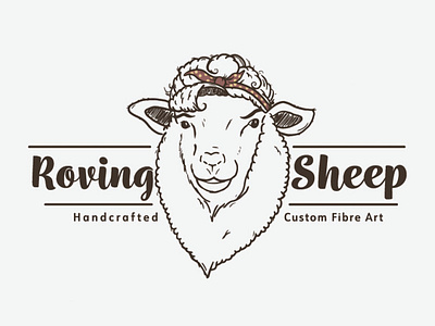
Hand illustrated logo for a custom fibre art company. Client found inspiration with Rosie the Riveter and wanted to incorporate that into the sheep logo to reflect that company was independently run by a strong, capable woman.
Typography was chosen to match curves and circular features of the logo itself. A slight vintage appearance and colouring was chosen to appeal to target market of both older woman but also younger, craft oriented customers.
And yes, I spelled "fibre" right - I am Canadian and so is the company.
