UI/UX design for Signal App
As a signal user, after shifting from whatsapp i faced few difficulties. As I discussed it with my friends, I found that they also face similar problems. Few of the problems that I marked after a small research, are: 1.The navigations are weak to understand. 2.The contacts looked clumsy. 3.No separate call records section.
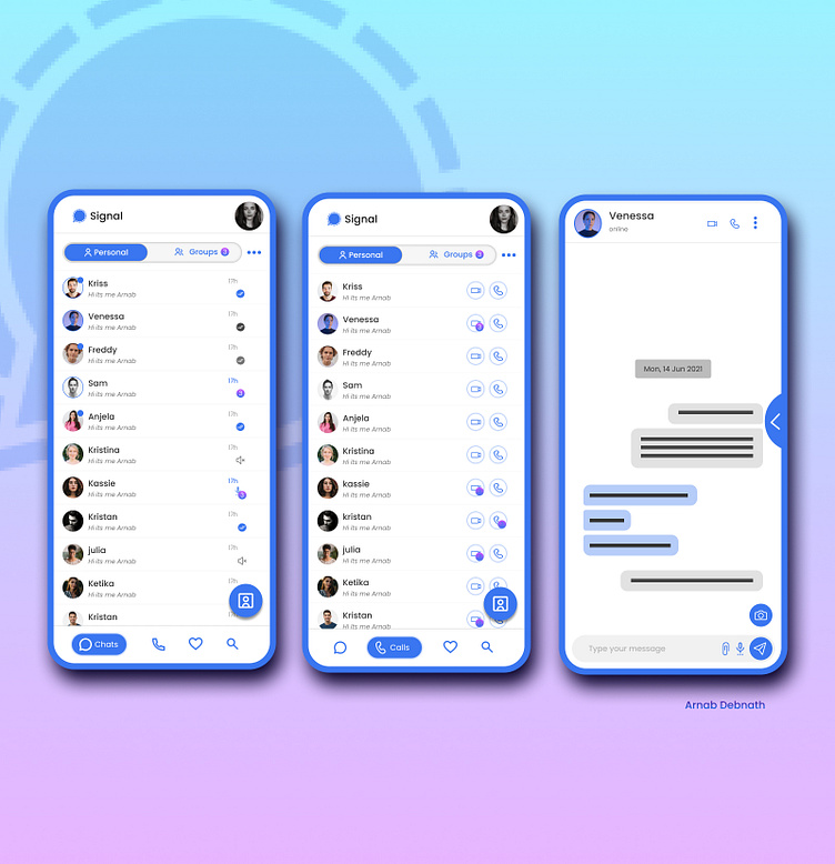
While ideating for this app, I thought of improving the app in many ways. The goals that I choose are: 1. To help users easily navigate to every section easily and quickly. 2.To make users comfortably chat to their closed ones.
Thinking of solutions for te goals I choose, I came up with these:
1.People use search option very often to find the contact, and for that they have to change their phone grip(phone with larger screen eg 5.5inch) while tapping on the search button and then change for typing. For that I thought of bringing the search option to bottom navigation bar. 2.Separate section for groups and personal chats will make it easier to keep track of every update easily. 3.Clear and identifiable contacts card. 4.Separate section for finding the call records.
These are few glimpses of my study. As this is a short case study done by me within a day. Hope you like it. Open for suggestions.
Thanks Regars Arnab Debnath
