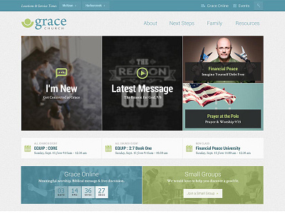
Grace Church - No Rotator Redesign
It was great to work with Grace church again. We often get stuck in the "large rotator, 3 boxes" home page. I am a huge advocate of content before design, and Grace church new what they needed to get people quickly plugged in. This responsive redesign sends a clear message to new visitors by presenting basic paths to get key content!
See the full project here » http://bit.ly/1gb3dIi
More by Jenn Craycraft View profile
Like
