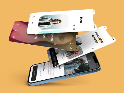
Store App Design | E-commerce
How’s it going, folks? I'm happy to share with you a concept design I made for an online clothing store. I see a lot of E-commerce stores today loaded with heavy information, multiple chips & scary navigations! 🤦♀️
I used a lean color palette because it helps users focus on products. The accent color is light yellow.
📱It’s easy to navigate within the app because there’s a minimum amount of elements. Yes, we can add tons of information to this and make it look like a Boeing A380 cockpit. But, I like it so much more this way.
Need a Website or an App Design?
Come, say hello: Rishabhshirker@gmail.com
More by Rishabh Thakur View profile
Like
