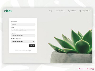
Minimalist Signup Page
Hi Guys! 👋
This is my minimalist signup page concept for plant website. I make this as minimalist as possible to achieve a higher visual clarity score from VisualEyes app.
Visual clarity is the measure of how visual component effectively prioritises and conveys information to the user👁🗨. In simple term a simple yet minimalist visual component can reduce user's cognitive load.
"More complexity requires more cognitive load. More cognitive load means less user engagement and sequentially less conversion"🧠🧠🧠
Press "L" to show some love 💖
More by Johannes Farrell View profile
Like
