Header Take Two
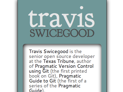
Not super happy with the way the text flows inside that box, but that's the idea. There should probably be more of a margin on the top. Bumped the "travis" up a bit so it doesn't get washed out.
More by Travis Swicegood View profile
Like

