BMF! #09 / NVIDIA
I am back in the fast refreshing business with this time the unfamous and inexpensive (cough cough) NVIDIA.
NVIDIA was founded in 1993 and apparently only changed one time their logotype in the firm's history.
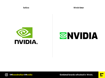
The current logotype doesn't have a bad type but the icon looks very cheap and unbalanced. For a leader of graphic processors manufacturers, the icon seems inaccurate and the color seems that it took the sun for 30 years.
We are at the age of speed, bright displays, high-end micro processing and manufacturing, NVIDIA should reflect the leadership of their field into their brand.
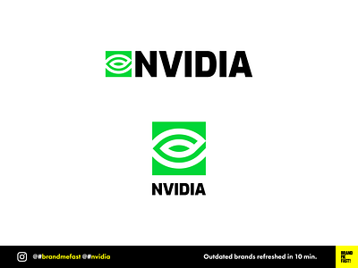
I thus decided to give it a vivid green color as well as a consistent and more symmetrical icon. I chose a font very close to the original but with a more legible N. It is interesting to see how the icon can be used as a pattern for other use in the identity.
Also, the geometrical and fairly simple construction of the logotype makes it easy to be responsive.
Hey, I see you comming, I know its not perfect, I just took 10 min on it ;)
FULL POST
www.instagram.com/p/CPp762ejuxG
BRAND ME FAST!
www.instagram.com/brandmefast
@brandmefast


